Thrive Brand Refresh & Clinic Expansion
Thrive Affordable Vet Care is disrupting the veterinary industry by providing widespread access to high quality, cost-effective vet care.
My Role:
Logo and Brand Refresh, Art Direction, Environmental Design
The Challenges:
Redesigning a brand’s style guide, marketing materials, and environmental aesthetic in time for a multi-city expansion.
Incorporating a brand partnership in the middle of the process
Counseling an extremely fast paced startup toward a more organized design process
The Process:
At the beginning of 2017, Thrive was preparing for a rapid expansion to open several new standalone clinics across Texas. As they approached this task, they realized that their branding lacked focus and cohesiveness. The client knew they needed help with redirecting their look and feel to reinforce Thrive’s brand values, so they enlisted me to help.
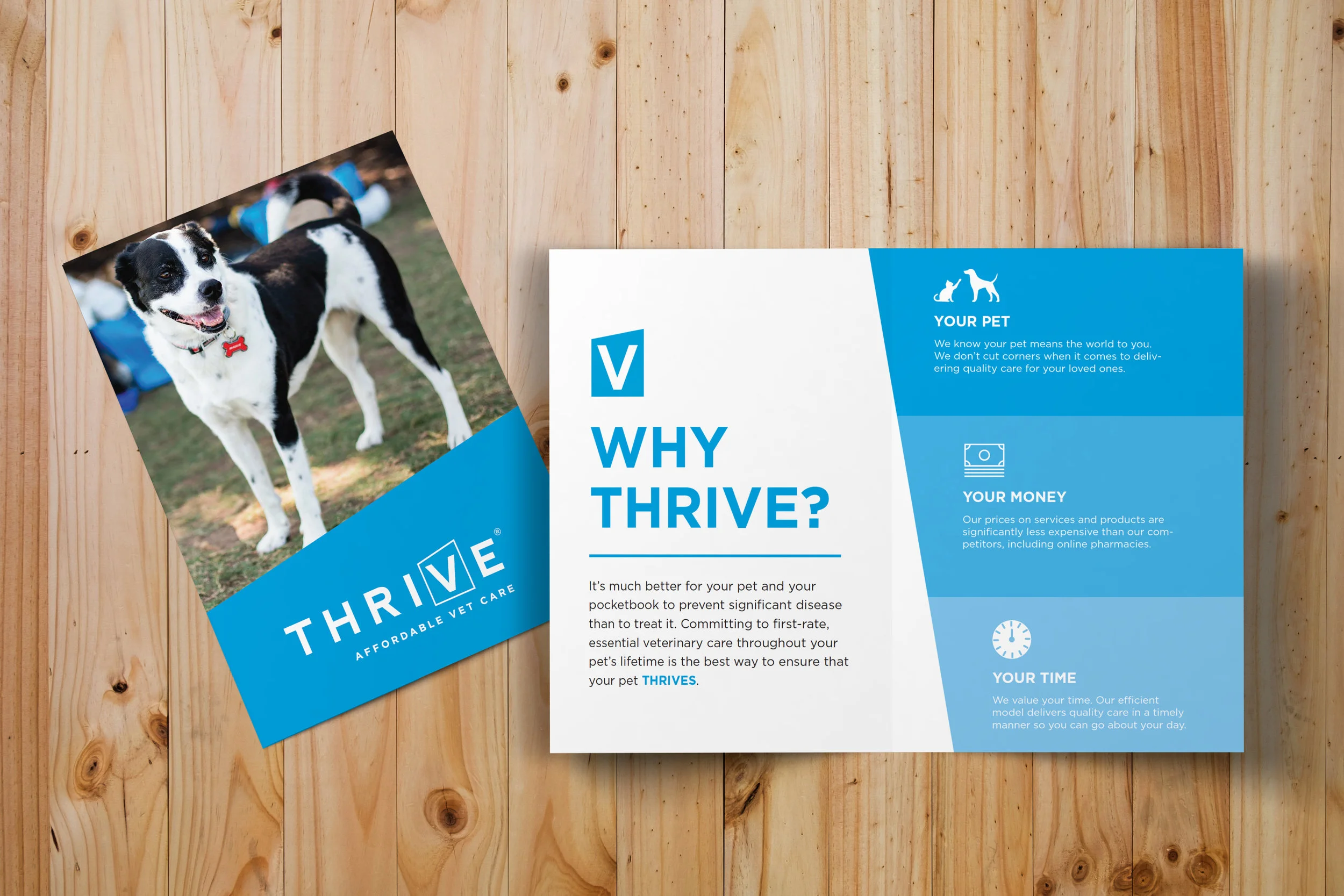
At the start of our relationship, Thrive’s main concern was pulling together new business cards and brochures before they opened clinics in Houston and San Antonio. As we talked through their struggles in producing a consistent look and feel, it became apparent that their original logo and style guide contained some core flaws. To start, the logo’s typographic spacing was inconsistent. The logo also included a gradient, which added unnecessary complexity and proved impossible to reproduce in embroidery and pin designs.
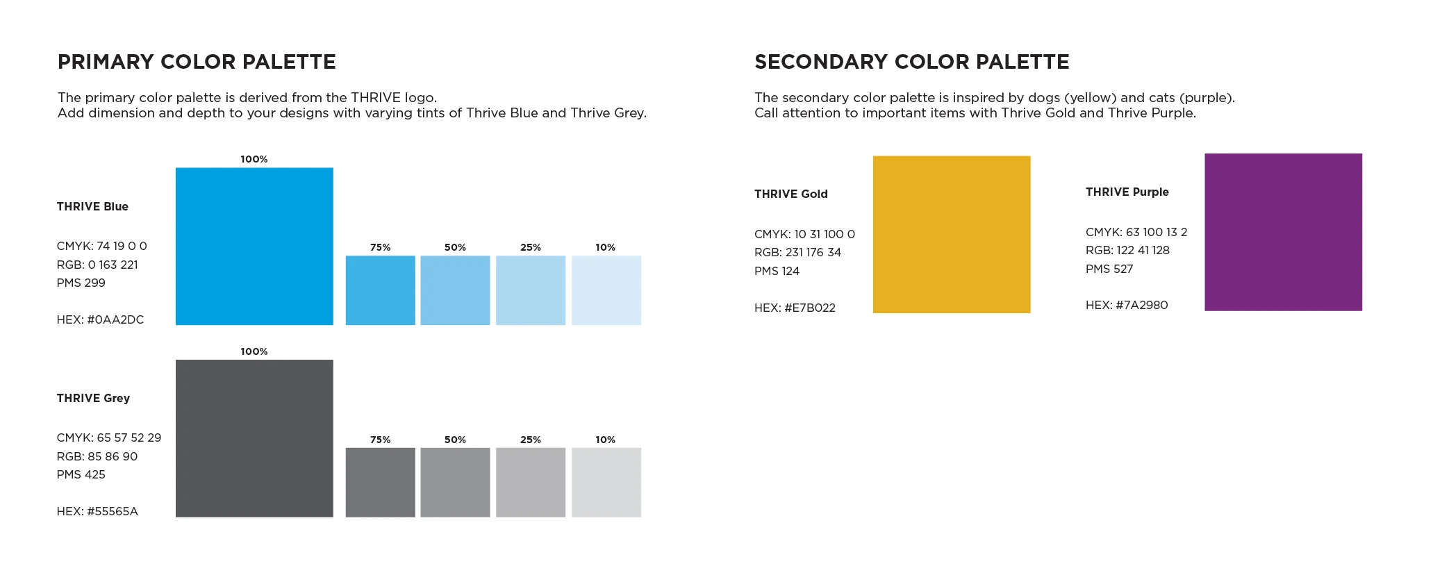
Along with cleaning up the logo, the rest of the branding needed attention. An unfocused style guide had left Thrive unable to make sense of their look and feel. My suggestion was to reduce the color palette and focus on their motivations for including secondary colors. The primary colors, Thrive blue and Thrive grey, could be used in varying tints to add visual interest while keeping the color palette limited. The rest of the color palette was chosen as follows: yellow represents the high energy of dogs; purple represents the moody nature of cats; and blue represents growth through innovation in healthcare. Additionally, blue is used on the business cards and jackets of veterinarians, while grey is used to identify technicians.
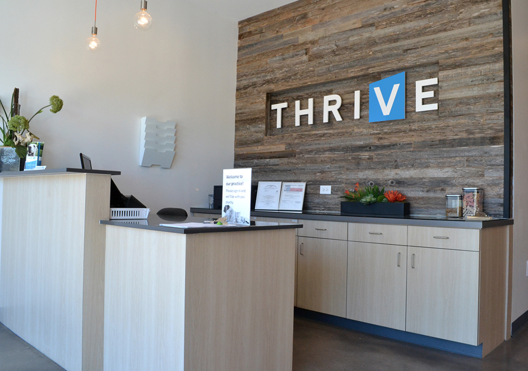
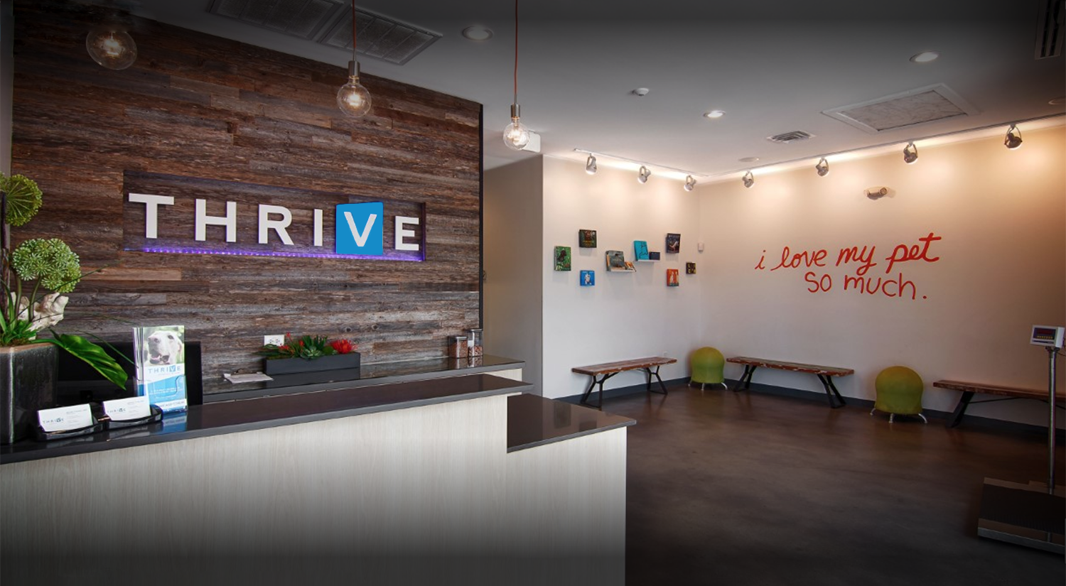
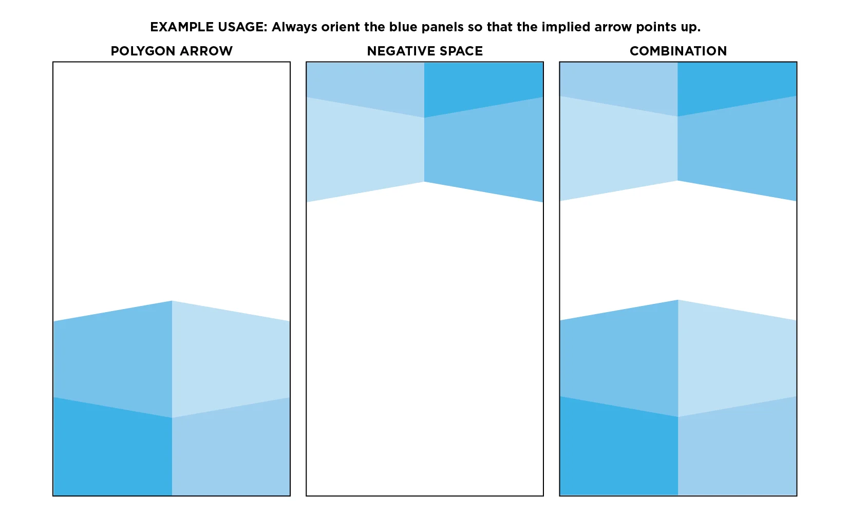
Using the updated style guide, I built a design system which has been invaluable as the client builds a presence over social media, printed materials, and environmental design. I repurposed the polygon used in Thrive's logo as a repeating element, which can either be used in its original "up and to the left" usage, or combined to form an arrow pointing up. The principal idea of incorporating the shape around the Thrive “V” in tints of blue is simple, eye catching, and specific to Thrive’s unique brand identity.
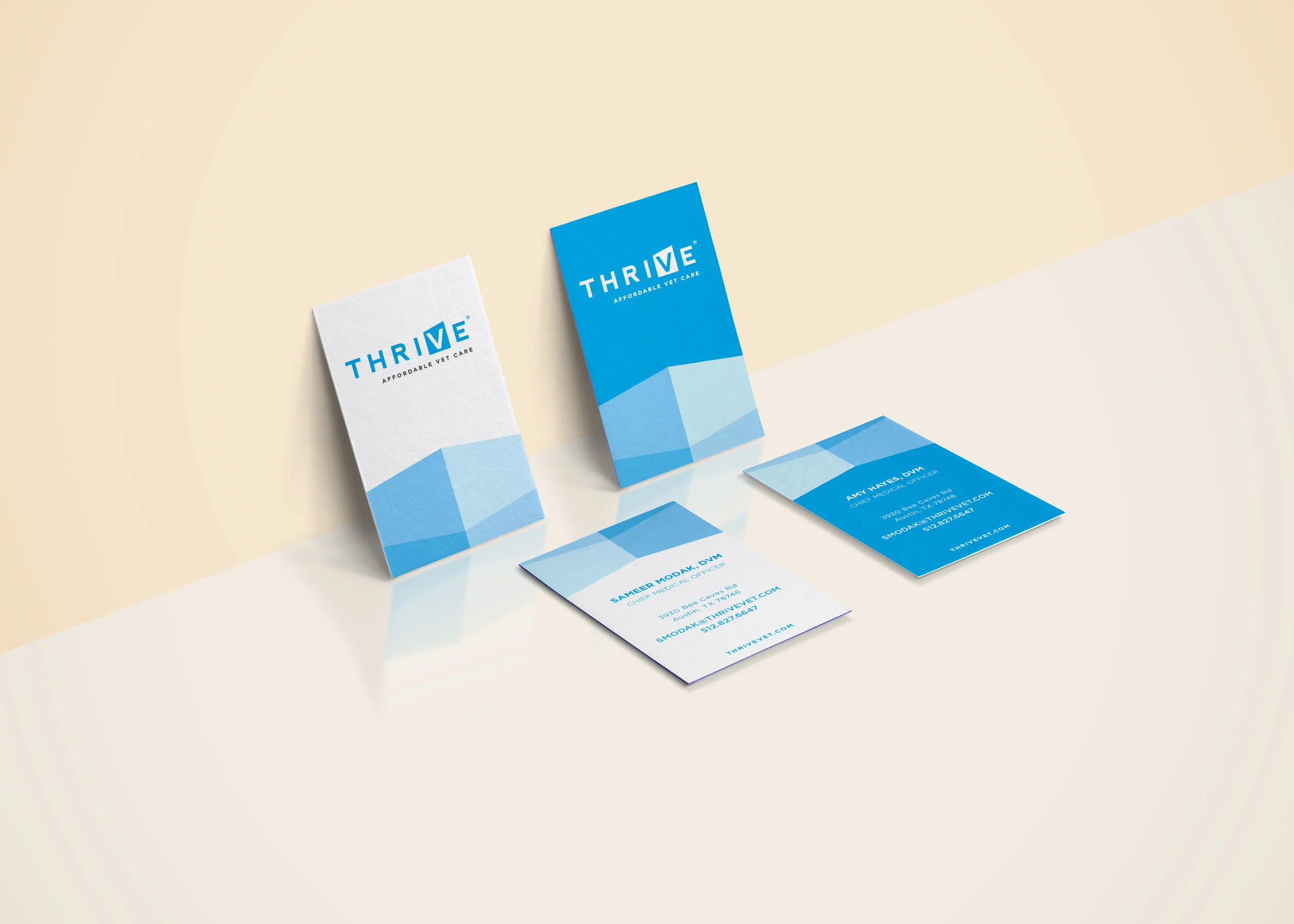
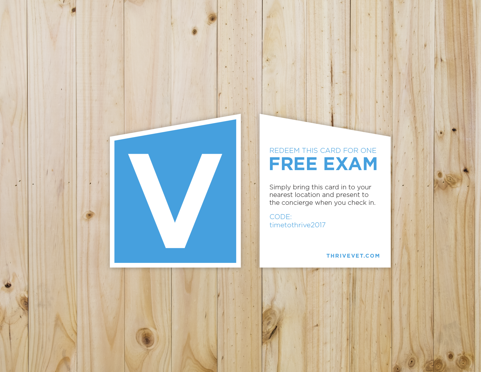
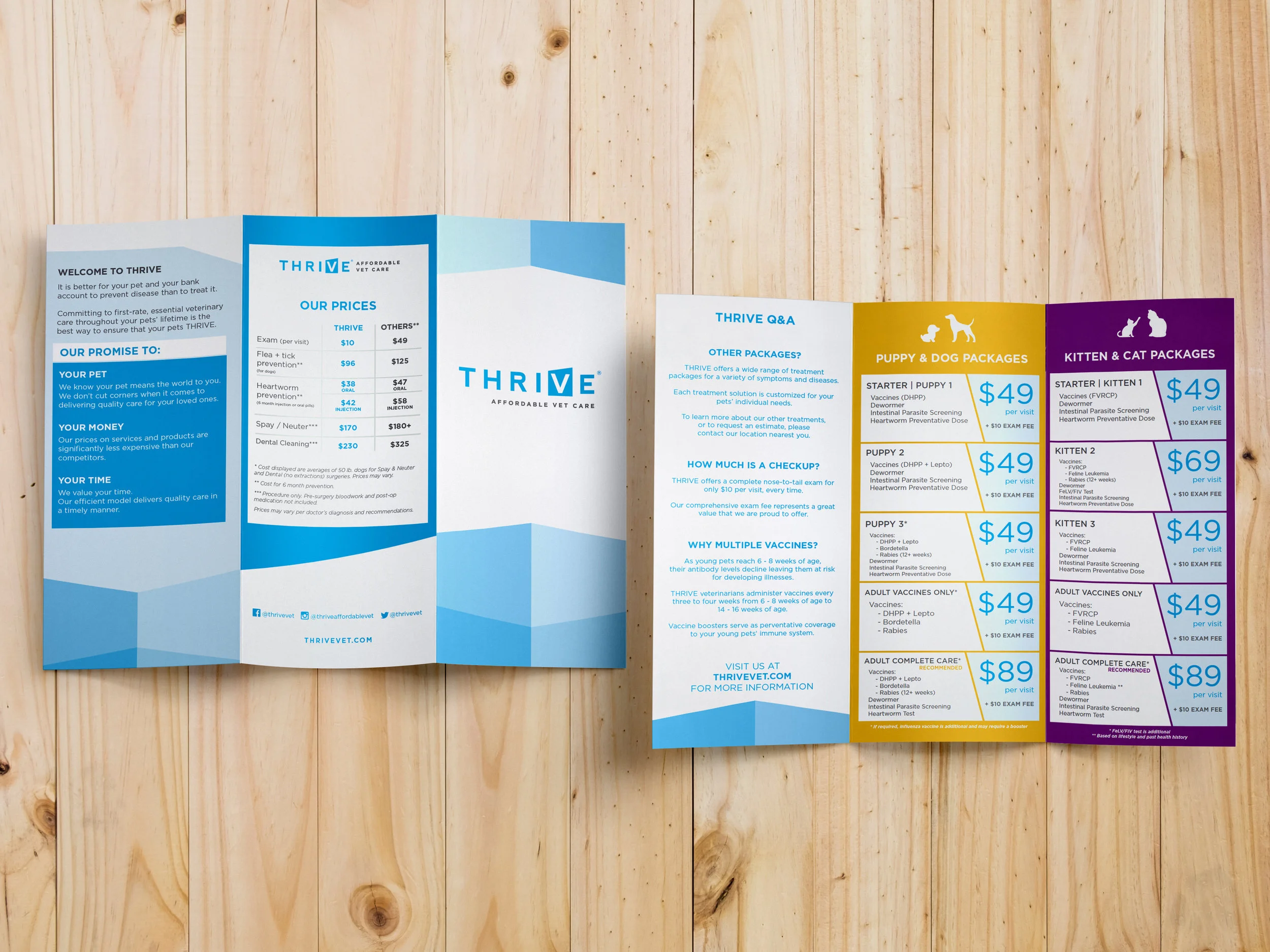
After the brand refresh was completed, we needed to start spreading the word of the new clinic expansion. With a solid design system in place, I applied the new look and feel to business cards, brochures, promotional materials, signage, and environmental design.
Surprise Challenge:
With multiple stakeholders and no formal process in place, Thrive was having difficulty nailing down their marketing language and pricing. I counseled the team to work together in finalizing content to reduce back-and-forth rounds of revision, helping them stay on track for important print deadlines.
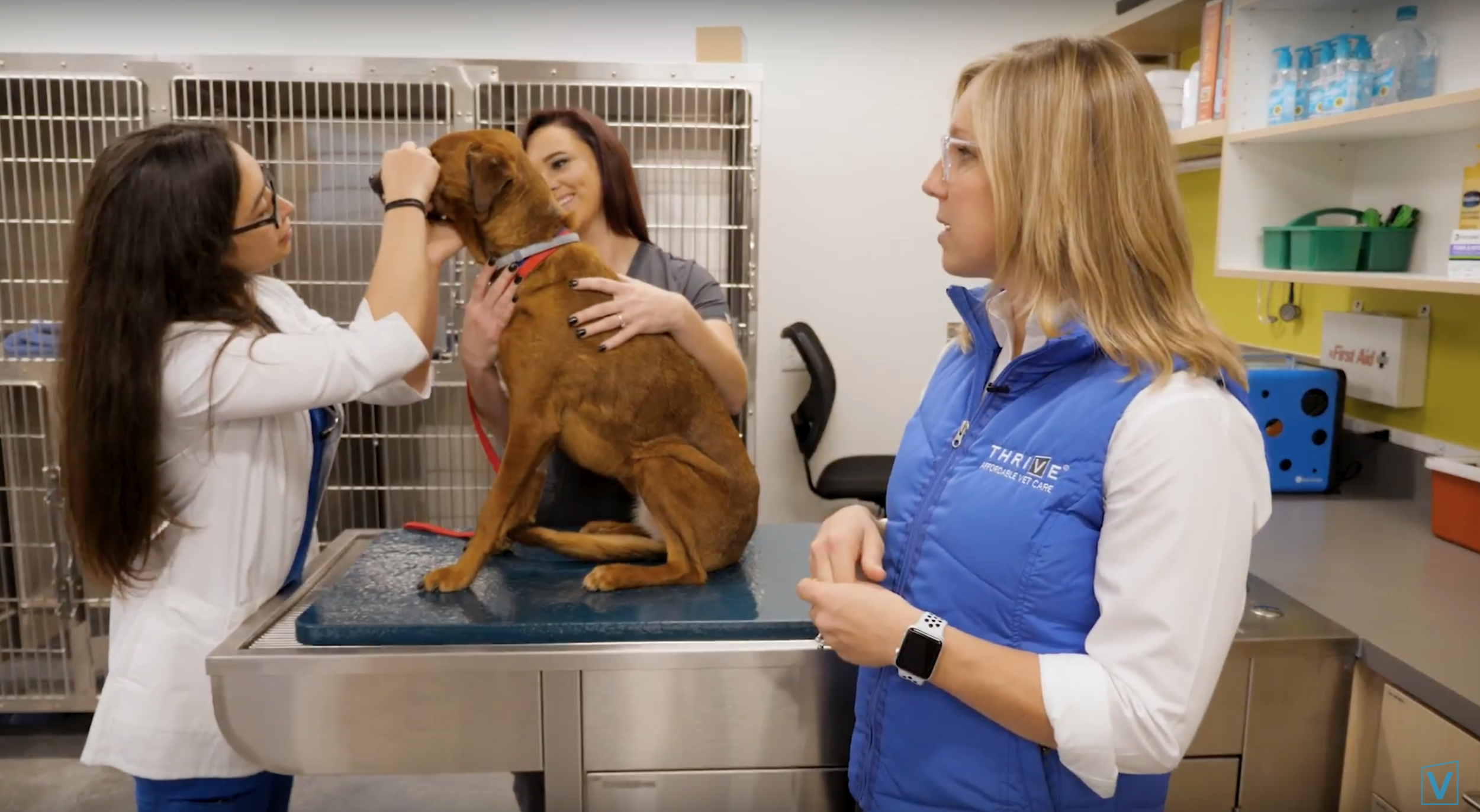
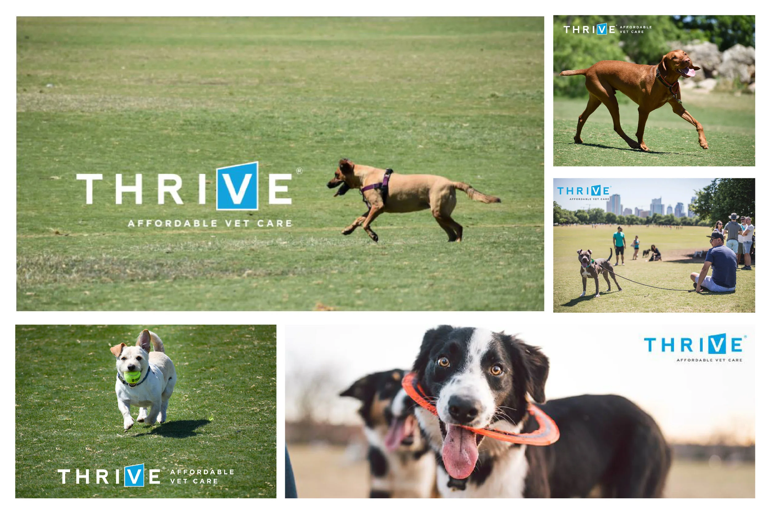
I also helped the client establish their social media marketing campaigns, creating all accompanying design visuals. For this part of the project, photography was essential. The client felt strongly about humanizing the brand by showing photos of Thrive employees with their own pets. To solve for this, we hosted an employee picnic at Zilker Park and enlisted the help of local photographer Alex Hopes (Zilker Bark) to take photos to use in Thrive marketing campaigns.
I also created a series of Facebook ads targeted to specific areas and interests, based upon metrics resulting from a survey administered by the client. I counseled the client in using design and copywriting to convey the brand’s mission in a way that engages the target audience, and connected the client with medical copywriting talent in the Austin community.
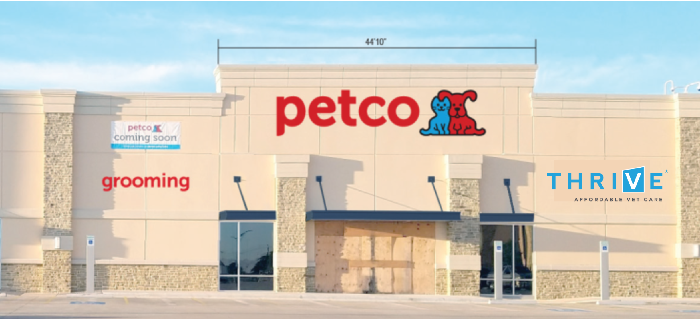
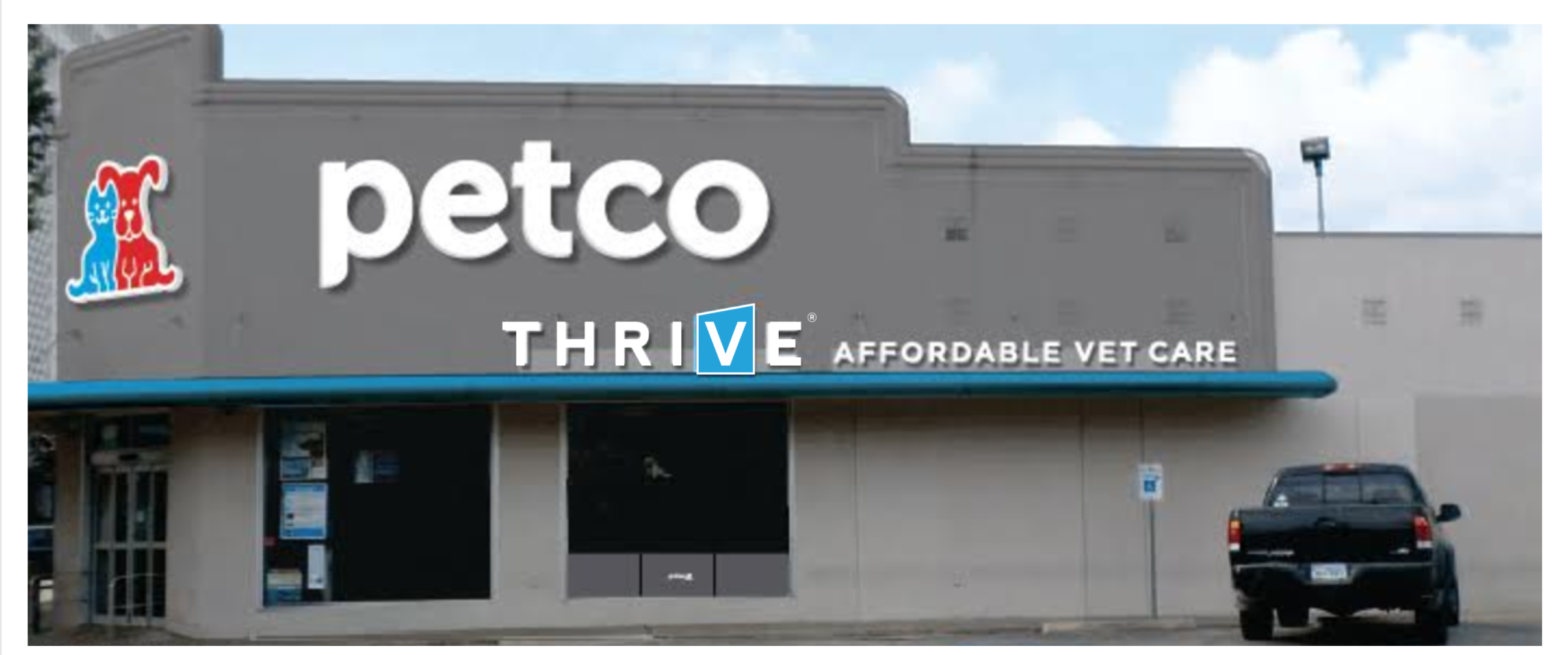
In the midst of this process, Thrive finalized the details of a major partnership with the pet supply giant Petco. This dramatically increased the number of new clinics Thrive would open in 2017-2018, and threw a few additional tasks my way. These tasks included a new Thrive + Petco lockup; incorporating the lockup and modified copy in all printed materials for Thrive + Petco locations; and quality checking all Thrive + Petco indoor and outdoor signage to ensure that the Thrive brand remained consistent, even when housed inside a Petco store.
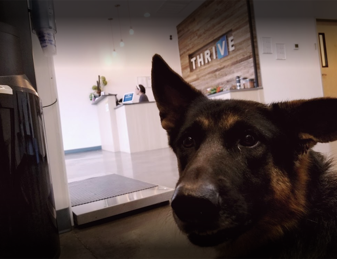
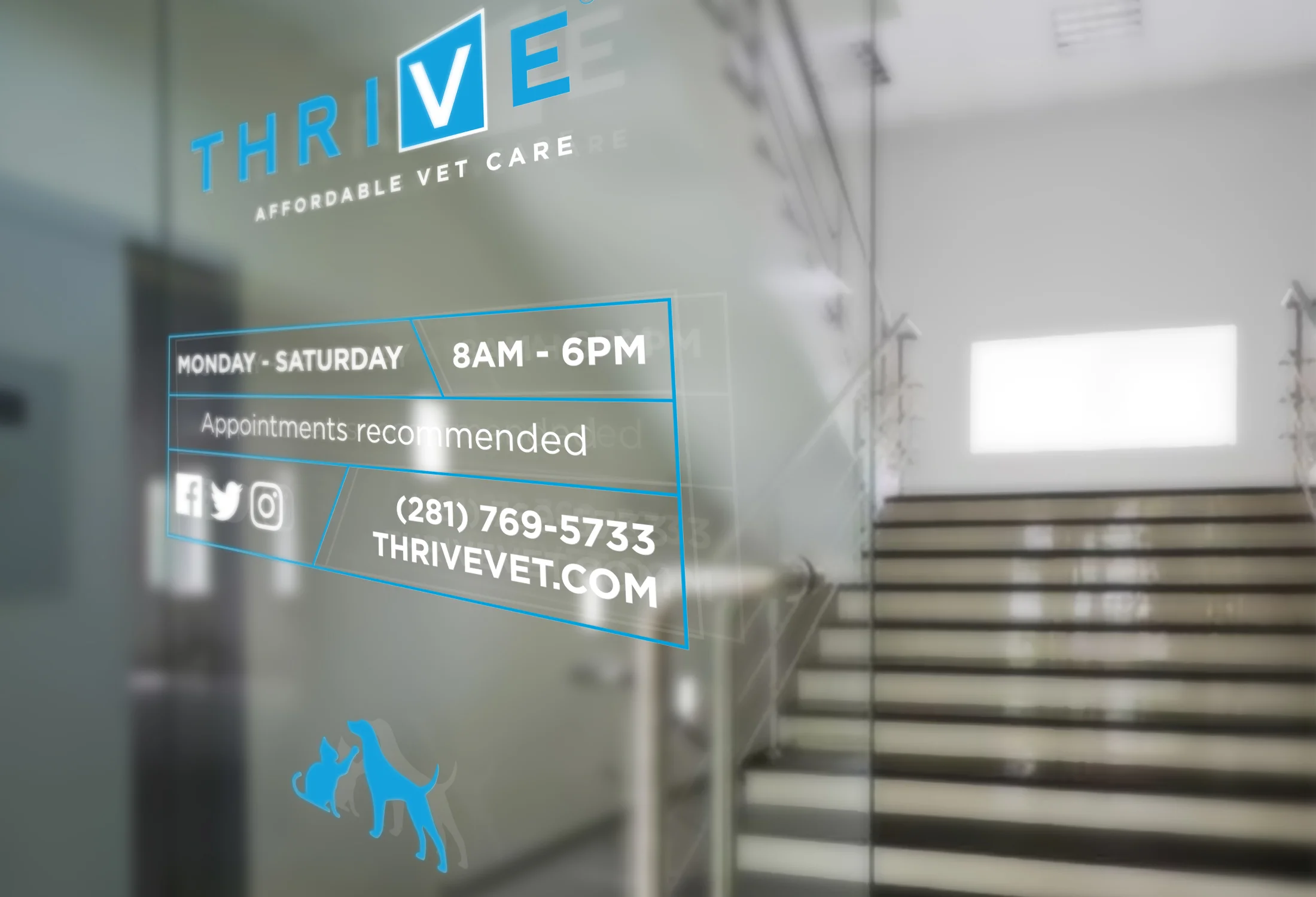
As we continue to open new clinics, we are still polishing details of Thrive’s environmental design. I’ve helped the client design the physical interior and exterior of the clinic spaces through choosing brand-compliant textures/surfaces and creating storefront signage, cut vinyl window treatments, and other elements. In the interior space, Thrive blue is primarily featured in paint, artwork, and fabrics; reclaimed wood is used to make the interior feel warm and inviting; and brushed steel is used to bring high end polish into the space.